The Arc browser is a new browser (est. mid 2022) that extends Chromium in some very novel and unique ways. Overall, after using Arc for about a month on my Apple Macbook Air M2 instead of Safari, I’ve decided to switch to it going forward as my default because it has so many great features and only a few demerits.
This post was written when Arc V1.33.0 was the latest version.
Good Features
The following are notable features special to Arc that I use regularly.
Layout
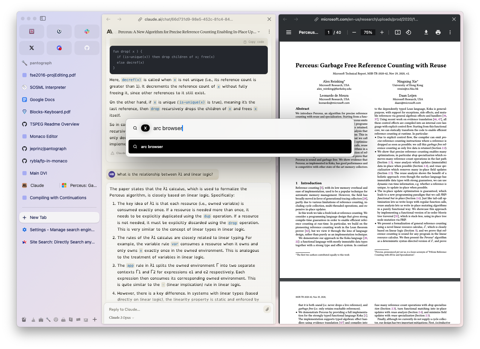
One of the first things you’ll notice that’s new about Arc is the layout. In contrast to typical browsers, Arc has the content stretch the entire height of the window, and keeps tabs and other organizational UI in a left sidebar.
While this is unconventional, I found it immediately felt much better and has obvious advantages.
- It’s much easier to keep track of a larger number of tabs, since many more tabs with their full name and icon displayed can fit vertically stacked in the left sidebar than most browsers could keep horizontally stacked in a top tab bar.
- Additionally, in this layout, tabs don’t get smaller the more you have of them. This helps me a lot with keeping a sense of intuitive spacial allocation, where I can just remember where I left a tab that I had put there before.
- A setting allows you to automatically hide the sidebar (it re-appears when the mouse hovers over the left edge of the window, similar to the “automatically hide dock” feature on MacOS). This works great with fullscreen mode, which is primarily how I use Arc. I previously had my MacOS dock on the left side of my screen, but I had to move it to the bottom in order to make it compatible with this feature of Arc.
Since you can expect to see most the name of a tab without having to click on it, it makes a lot of sense to rename tabs as well. Often websites have features that name a tab based on some process happening in the window, so I usually rename pinned tabs that I am always coming back to in a way that’s easy to recognize immediately.
Tabs — Today, Pinned, Favorite
Arc comes with a new way to organize tabs within spaces. There are three kinds of tabs: Today tabs, Pinned tabs, and Favorite tabs.
- A Today tab is meant to be mostly temporary — it shows up below Pinned tabs in the tabs column, and is archived automatically after a certain period of time (or this feature can be disabled). The idea is that while you’re exploring a variety of webpages, you open each tab first as a Today tab, and then as you recognize certain tabs as important that you keep coming back to, you move them to Pinned to keep them around longer. And if you keep the automatic archiving feature (I do) then the unimportant tabs will clean themselves up over time. Sometimes I do have to search my history for a tab that I realized was important later on, but that isn’t too difficult and much more of the time the conscious effort required to move a tab to Pinned is not too little or too much friction to indicate that a tab is worth keeping (with one caveat — integration with the Arc Sidebar mobile app).
- A Pinned tab is meant to be mostly permanent — it shows up at the top of the tab column of a space, and stays there unless you explicitly remove it (delete it or move it to the Today section). The normal tab close action will only close the open instance of the tab, not remove it from the Pinned section of the Space. Following a link from a Pinned tab opens as a Today tab.
- A Favorite tab is meant to be permanent and persistent — it shows up as a larger tab in the Favorite tab table which is above the Space’s tab column (they’re kinda like pinned tabs in Safari or Chrome). As its position indicates, Favorite tabs are accessible from any Space. Each Favorite tab’s name is the favicon of the website, blown up to be very visible, rather than a text name. Following a link from a Pinned tab opens as a Today tab in the currently active Space. You can set a Favorite tab to be always loaded, so no matter what space you’re in or if you restart Arc, you will get notifications from those tabs (I used this for chats such as Slack and Discord). For some websites Arc also supports some special features if you make them Favorite tabs. For example, having a Favorite tab for Github will present on hover a list of open PRs (clickable links) associated with you, and having a Favorite tab for Notion will present on hover a list of recent notes (clickable links).
Spaces
Now that you know about the kinds of tabs, we can talk about Spaces. A Space is like a tab group — it contains a column of Pinned and Today tabs. Everything about a Space is shown in the sidebar, and at the bottom is the Space navigator which you can use to instantly switch between spaces. The Arc window is not linked to a Space, so you can switch spaces while staying in the same window.

Overall, spaces with today/pinned tabs are a great improvement over tab groups and bookmarks in Safari (and other browsers, typically). If there’s a topic I know I want to keep open for a while: I make a new space, name it appropriately, pin a few tabs that I will always come back, and do less organized exploration with the Today tabs; when I notice a Today tab is something I keep coming back to or I otherwise want to remember it, I’ll pin it, and otherwise it’ll just disappear over time which leaves the tab group nice and clean. This was a major issue I had with tab groups in Safari — the tab group represents a collection of interesting links, but as I open more and more it gets more and more cluttered and its too annoying to navigate the links in order to prune it to make it less cluttered. So eventually I just have to make the “v2” of the tab group that represents my second attempt at exploring the topic. And I have tons of tab groups I never come back to since its just too annoying to preview a tab group without opening a dozen tabs and going through them one by one to figure out what they actually are.
Fast Tab Switching
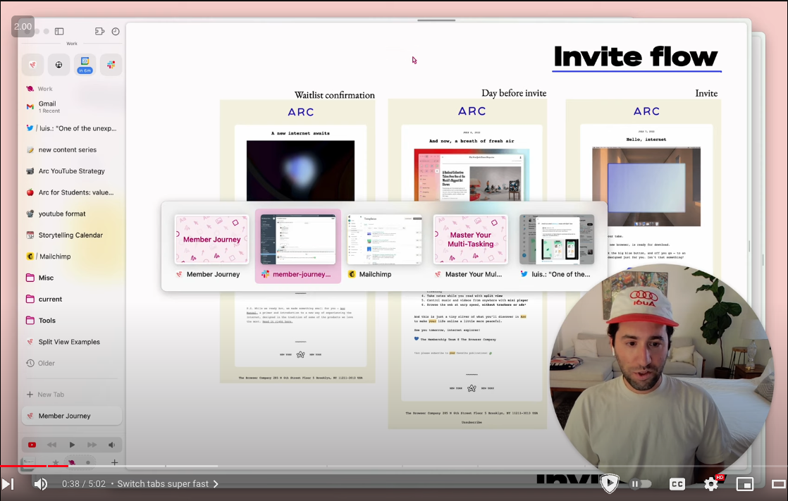
Arc keeps track of tabs you’ve been to recently or opened in a new tab. You can quickly switch between these with CTRL+Tab, just like you would switch between applications natively in MacOS with CMD+Tab. I use this all the time, almost always instead of actually looking for a tab in sidebar as I’m quickly opening and closing lots of tabs, and I can’t believe other browsers don’t have it, it just makes so much sense. [demo]
Syncronized Window Instances
Not only is each Arc window not linked to a specific Space, but Spaces are synchronized between all windows. That makes it so that for the most part, I just need one main Arc window open at a time (in fullscreen mode), and I just switch between Spaces within it rather than managing multiple Arc windows or arrangement of Arc windows in desktops. Then for Arc windows I have setup in splitscreen with other apps, when I jump to that screen the Arc window is always up to date with whatever I’ve added to that space.
Split View Tabs
You could use native MacOS splitscreening with multiple windows, but Arc provides an even better feature of splitview tabs. Any tab can be dragged onto another in order to arrange those tabs in a splitview horizontally. Any number of tabs can be split like this. The new combination tab acts like a single tab for the sake of tab navigation and manipulation.

Search/Command Bar
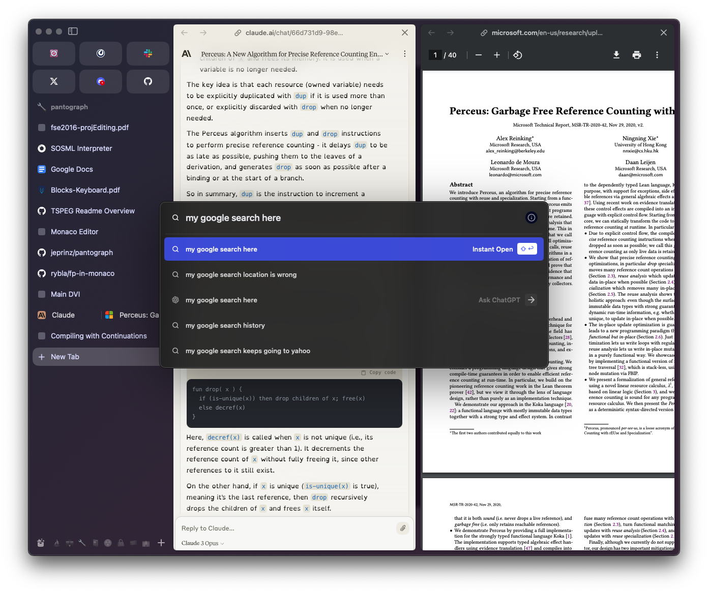
One of the differences between Arc and other browsers that comes up the most is interaction with the URL bar. In Arc, there is no URL/search bar at the top of the window (there is one at the top of the sidebar if you choose to see it). Instead, you bring up the command bar using CMD+T. The command bar is basically the URL/search bar but with some extra features. The UI is really great though as it pops up the command bar right in the center of the screen — big and in focus.
- searches tabs from any space (and archive), so you can just jump to the open tab rather than open a new copy
- starts a ChatGPT conversation with the text as the prompt
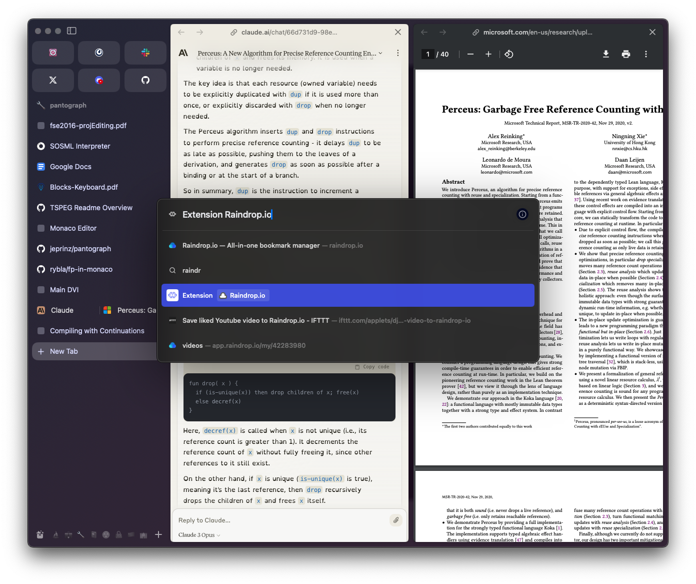
- trigger some extensions
- example: I can add a Raindrop bookmark of the current URL by
CMD+T raindropand selecting the appropriate dropdown menu option.
- example: I can add a Raindrop bookmark of the current URL by
- some site-specific searches (similar to bang patterns in duckduckgo or ChatGPT (doesn’t work with other AI assistants (yet?))
- The command bar opens the result in a new tab, but you can get the “in-place” version of the command bar for the current tab via
CMD+L, which appears pre-filled with the current URL (this is also how you can get or edit the current tab’s URL).
Find or Ask AI
Like every browser CMD+F opens up a search query that highlights results found on the page. Novel to Arc is the native integration of AI — if you type something that isn’t found on the page, Enter with start an AI chat that is loaded with the current page in context (or a truncation of it if the page is too long).

A priori it might seem odd that Find and Chat are accessed the same way, but in practice it makes so much sense. For example, if I’m reading software documentation and I want to find something quickly without reading all the context to understand where it is, I first start by CMD+F for a keyword I am looking for, and if that’s not found or the results are not helpful I change the query to “how to …” or “what is …” or the appropriately phrasing that usually uses the keyword I originally had.
It’s also useful to have a quick way to summarize an article you are skimming (e.g. it was linked to by another article you were focussing on, and this one’s just for some brief context). However, for this kind of situation the next feature is also particularly useful.
It looks like Arc is planning to a lot with Max, Arc’s AI Assistant integrations. I’m not sure how much of it will be actually useful, and how much is purely justification for saying “AI-powered” more often, but so far so good.
Link Summaries via AI
If you hover over a link for a second (this used to require holding Shift), a little box will appear nearby it with some text generating into it. This is a formatted snippet, generated by AI, that summarizes some key points it gathered from scraping the webpage. The result is cached so if you hover over that link again it reuses the previously-generated summary.

I find this useful all the time for taking a quick peek at links cited in articles that I would have otherwise probably not clicked. However, I don’t think its often made it so I don’t have to actually click a link that I normally would have — the summaries are really just short bullet points so you know what the main topics of the linked webpage are, and don’t give much idea of the specific content.
Little Arc
Little Arc is an Arc window that is not associated with a Space. If you set Arc to be your default browser, then following a link from another application will open in Little Arc. From Little Arc, you can quickly add the current page to a specific Space of course.
I find Little Arc to be super useful — much more useful than I expected. For example, if I follow a link from an email, a chat app, a calendar event Zoom link, etc. it opens in its own new Little Arc window rather than making my view jump to whatever the most recent browser window is and adding this new unrelated link to whatever collection of tabs I was already working with here. Especially working with fullscreen apps, it’s so annoying to have to jump to another screen just to quickly follow one link.
Automatic Picture-in-Picture Popout
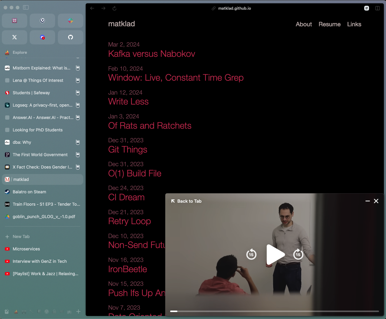
This is a feature I didn’t know I wanted. Arc has it’s own implementation of picture-in-picture, MiniPlayer. When you have a picture-in-picture enabled view active in one Arc tab, then when you leave that tab (by going to another tab or another application) picture-in-picture starts automatically. This works with, for example, youtube videos and google meet calls. So far I’ve found it really nice to be able to, while in a Google Meeting, quickly start using the same browser window as normal without having to open a new window to manage, and have the picture-in-picture automatically take care of keeping the meeting visible.
Boosts
Arc provides a neat interface for defining “lite extensions” i.e. some custom CSS to from the client site into a specific webpage’s html. You can also inject Javascript, but Boosts that don’t support sharing by Arc natively for security (of course you can just share the Javascript directly). There isn’t much available in the Boost Gallery yet, but I like the idea and look forward to finding useful Boosts, such as the following:
Additionally, it’s basically an easy way to hack your own dark mode, custom formatting (i.e. change fonts), or ad blocker (you can delete any html elements permanently) on any website. I’ve used it ad hoc several times and it’s really amazing how simple they made it to do the most common things which are custom dark mode and ad blocking.

One major limitation is that you can only have one boost per webpage, so I can’t activate a custom Youtube theme at the same time as blocking youtube shorts. So I have to choose the more important of the two, which is fortunately an easy choice.
Easels & Notes
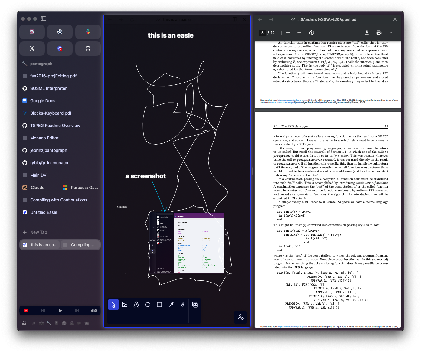
Arc has native support for Easels, which are little workspaces taking notes and making sketches in a tab that can be manipulated like any other tab. I actually haven’t used Arc’s built-in version of this for anything, but Arc also integrates with Notion which I use as my main note management tool. As a result there’s a keyboard shortcut to make a new note in Notion and I can access a recent notion page from a dropdown menu triggered by hovering over the Notion Favorite tab.
Chromium
Since Arc is based on Chromium, pretty much all Chrome extensions work on Arc (including all the ones I use e.g. Raindrop, Adblock Plus, uBlock Origin, Video Speed Controller)
Demerits
Chromium
Since it’s Chromium, it’s not as integrated with the Apple ecosystem as Safari, so there are still somethings that I go to Safari for. One particular thing this is annoying for is passwords, since I use the Safari password manager to generate and save passwords (auto syncs with my iPhone). Beyond that, it doesn’t really have its mobile solution worked out either — see the next demerit.
Mobile Apps
There are two Arc mobile apps: Arc (Sidebar) and Arc Search.
- Arc (Sidebar) syncs with your Spaces on the desktop app, but doesn’t have as slick an interface and isn’t considered a browser by iOS for some reason so you can’t even set it as your default browser.
- Arc Search is a real browser according to iOS, but it doesn’t sync with your Spaces on the desktop app. Basically it’s a totally separate browser instance, and a different version too since it doesn’t even have spaces — it’s just one big space. And no basic features like bookmarks or Pinned tabs or anything.
Overall, my sense is that The Browser Company just doesn’t know how they want to do mobile yet, but they knew they needed something so they gave us something.
Arc Search is pointless, almost a joke for how featureless it is. Why is it even called “Arc” at all? Arc (Sidebar) is pretty nice, even if it’s not fully polished, and I would set it as my default mobile browser today — if I could. It makes no sense that it’s not a real browser according to iOS. I’m guessing that this is some weird technical limitation to integrating with iOS that they haven’t solved yet.
I’m sure they are planning to integrate Arc Search and Arc (Sidebar) in the near future. In its current state, the mobile experience is not worth switching browsers even though I use Arc on Mac. The only reason I keep Arc installed at all is it allows me to “share” links to Arc from other mobile apps, which I have Pinned to a certain space so that I can review them later on my Mac.
Spaces Management
So far there doesn’t seem to have been much though put into managing a large number of spaces. While I’ve not gone over ~8 spaces at a time, I soon will and I’m not hopeful for the experience.
Currently, spaces are arranged linearly, and you have to scroll horizontally through them. While the spaces view is ok since it does let you see all the tabs in each Space as you scroll through them, it really has to improve a lot in order to be useful for large collections of spaces. If I have 100 spaces, I at least one a smaller view of each space so I can see more than 5 spaces at a time while I’m looking for the right one.
Also, it’s fairly easy to move one tab from one space to another — this action is available in a right-click menu from the tab. But, its painful to move several tabs from one space to another, since moving the first tab will jump you to that space, and then you have to go back to the original space and go through the right-click menu again, for each tab.
And one more thing — I’d like to be able to make a new space to add a tab from Little Arc to rather than having to add it to an existing space. There are several times that I have a link open in Little Arc from an email or message or something and I know it is the start of a Space, but I have to first go to a main instance of Arc in order to create the Space, and then I can come back to the Little Arc tab and add it to the new Space.

Weird Interactions with Site-Specific Keyboard Shortcuts
I can see there were some difficult choices to make with keyboard shortcuts: since Arc provides so many of them, it developed a system for requiring you to press the keyboard shortcut twice in order to confirm if that keyboard shortcut is in conflict with a keyboard shortcut provided by a webpage. In theory this is ok, but in practice it can be very annoying because the whole point of keyboard shortcuts is to be able to do something quickly without thinking about it, and having to figure out why it’s not happening and then doing something unique to any other app can disrupt the smooth usage of a keyboard shortcut significantly. Personally I just removed all the Arc keyboard shortcuts except for the essentials which basically never conflict with existing shortcuts on websites.